
Long living rooms can feel like design traps. Too narrow, and furniture floats awkwardly in the middle or hugs the walls like wallflowers. Too stretched out, and you’re left with a bowling alley that echoes. The good news? With intentional zoning, smart furniture choices, and a few optical tricks, a long skinny living room layout can become one of the most functional spaces in the home. This guide walks through seven practical strategies to break up length, maximize usability, and make a narrow room feel balanced, no structural work or big-budget overhaul required.
Key Takeaways
- A long living room layout succeeds when you divide the space into 2–3 distinct functional zones with strategic furniture placement rather than treating it as one continuous box.
- Position your sofa perpendicular to the length, not against the long wall, and use shallow-depth sofas (30–32 inches) to maximize floor space in narrow rooms.
- Use multiple area rugs and layered lighting—table lamps, wall sconces, and pendant lights—to anchor each zone and interrupt the tunnel effect rather than emphasizing length.
- Paint short walls in bolder colors and long walls in light, receding tones to visually pull the room inward and create better proportions.
- Mount curtains at ceiling height and extend to the floor, use horizontal gallery walls on long walls, and place mirrors on long walls to reflect width and boost natural light.
- Choose vertical storage solutions like tall bookcases or wall-mounted shelving on short walls to add perceived height without consuming floor space in your long living room.
Understanding the Challenges of Long Living Rooms
Long living rooms, typically those with a length-to-width ratio exceeding 2:1, present a few recurring headaches. First, the tunnel effect: when one wall faces another across a narrow span, the eye gets drawn straight down the length, amplifying the proportions. Second, the dead zone problem: furniture arranged along the perimeter creates an unusable gap in the center, while centering everything leaves awkward circulation paths. Third, acoustic issues: hard parallel surfaces can bounce sound around, making conversation feel echoey or flat.
These aren’t insurmountable. The key is treating the room as multiple smaller areas rather than one long box. Think of it like framing a hallway into distinct stops instead of a continuous corridor. Most successful long narrow living room ideas rely on creating visual and functional breaks that interrupt sightlines, anchor activity zones, and give the eye places to rest.
Before rearranging anything, measure the room’s actual usable dimensions, not just wall-to-wall, but accounting for door swings, radiator clearances, and any built-ins. Note window placements and electrical outlets. These will dictate furniture placement more than any Pinterest board.
Create Zones to Break Up the Length
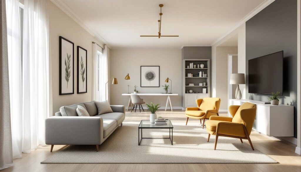
The most effective way to counter a long living room’s proportions is to carve it into two or three distinct zones. This doesn’t require walls or permanent dividers, just intentional furniture groupings and clear activity boundaries.
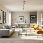
Start by identifying what the room needs to do. Common pairings include a primary seating area (sofa, chairs, coffee table) and a secondary function zone (reading nook, home office, or dining space). If the room exceeds 20 feet in length, a third micro-zone, like a console table with stools or a small bar cart setup, can fill the gap without crowding.
Position the largest furniture grouping (usually the seating area) toward one end, ideally anchored by a focal point like a fireplace or media console. Then place the secondary zone at the opposite end, leaving a clear path between them, 36 to 48 inches is the standard walkway width for comfortable circulation. Avoid pushing all furniture against the walls: floating pieces away from the perimeter actually makes narrow rooms feel wider by defining negative space.
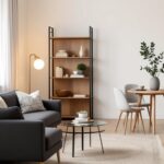
A console table or open shelving unit placed perpendicular to the length can act as a soft divider between zones. Choose something with visual transparency, slatted wood, metal frames, or glass shelves, so it doesn’t block light or sightlines entirely. This tactic helps with furnishing long, narrow rooms by creating intimacy without sacrificing openness.
Furniture Arrangement Strategies for Narrow Spaces
Furniture scale and orientation matter more in a long living room than almost any other layout. Oversized pieces exaggerate narrowness: undersized ones leave the room feeling unfinished. The goal is balance and proportion.
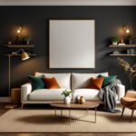
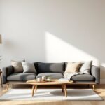
Avoid placing the sofa against the long wall. It amplifies the tunnel effect and wastes the room’s cross-dimension. Instead, position the sofa perpendicular to the length, either floating in the middle of the room or angled slightly to break up rigid sightlines. If the room is especially narrow (under 10 feet wide), consider an L-shaped sectional tucked into one corner, with the chaise extending along the short wall. This creates a cozy conversation zone without blocking traffic.
For additional seating, skip matching armchairs flanking the sofa. Instead, use a pair of lightweight accent chairs or a bench that can be moved as needed. Chairs with exposed legs (rather than skirted bases) help maintain visual flow. If space is tight, nesting stools or poufs offer flexible seating without permanent footprint.
Coffee tables should be proportionate: a long, narrow cocktail table (think 48 to 60 inches long, 18 to 24 inches wide) works better than a chunky square. Alternatively, use two smaller side tables that can be separated or clustered. Glass or acrylic tops reduce visual weight, which is especially helpful in darker or windowless stretches.
Choosing the Right Sofa and Seating Configuration
Sofa selection hinges on two factors: depth and back height. In a narrow room, a shallow-depth sofa (30 to 32 inches) leaves more floor space than a deep lounger (36+ inches). But, if the room is long enough (over 18 feet), a deeper sofa can actually anchor the space and prevent a cramped feel.
Low-profile sofas, those with seat backs under 32 inches, help maintain sightlines and prevent the room from feeling divided. High-back sectionals can work if positioned strategically, but avoid placing them where they’ll block windows or create a visual barrier mid-room.
If the layout supports it, try an H-configuration: sofa on one side, loveseat or pair of chairs opposite, with a narrow coffee table between. This setup works well when the room is at least 11 feet wide and encourages face-to-face conversation. For tighter widths, stick to an L-shape or single sofa with flanking chairs at angles.
Use Rugs and Lighting to Define Areas
Rugs and lighting are non-structural tools that reinforce zoning and correct proportion issues.
Rugs should be sized to anchor each functional zone, not run the full length of the room. A common mistake is using one long runner, which just emphasizes the length. Instead, use two or three area rugs sized to fit under the footprint of each furniture grouping. For the main seating area, aim for a rug large enough that at least the front legs of the sofa and chairs rest on it, typically 8×10 feet or larger. For a secondary zone (desk, reading chair), a 5×7 or 6×9 rug can define the space without overwhelming it.
Choose rugs with patterns that run horizontally or feature bold, grounding motifs. Avoid long stripes that run parallel to the length, they’ll amplify the tunnel effect.
Lighting should be layered and zone-specific. Overhead fixtures are fine, but relying solely on a central ceiling light flattens the space. Instead, use a mix:
- Table lamps or floor lamps at each seating zone to create pools of light and visual stops.
- Wall sconces mounted at mid-height (around 60 to 66 inches from the floor) to draw the eye horizontally and add ambient warmth.
- Pendant lights or a linear chandelier over a dining nook or console table to anchor that area.
Dimmer switches let you adjust mood and focus attention where needed. In narrow spaces, warm-toned bulbs (2700K to 3000K) feel more inviting than cool white, which can make tight rooms feel clinical.
Optical Tricks to Balance Proportions
Visual tricks can reshape how a long living room reads, even if the dimensions stay the same.
Paint the short walls a darker or bolder color than the long walls. This visually pulls the ends inward, making the room feel less stretched. Conversely, keep long walls in lighter, receding tones, whites, soft grays, or pale blues. If the room has molding or trim, painting it the same color as the walls (rather than contrasting white) reduces visual choppiness.
Horizontal elements, like wainscoting, shiplap, or picture rails, installed on the long walls create cross-dimension interest. Avoid vertical stripes or tall, narrow artwork on long walls: instead, hang wider pieces or arrange a gallery wall in a horizontal grid. On the short walls, vertical art or tall bookshelves draw the eye up and add perceived width.
Mirrors are classic space-expanders, but placement matters. A large mirror on a short wall reflects the length back, which can backfire. Instead, place mirrors on long walls to reflect the width and bounce natural light. Leaning a floor mirror against a short wall at an angle can soften hard edges and add depth without amplifying the tunnel.
Curtains should be mounted as close to the ceiling as possible and extend to the floor. This vertical line lifts the eye and balances horizontal sprawl. If windows are on a long wall, consider floor-to-ceiling panels in a light, airy fabric to frame views without adding visual weight. Many small space decorating strategies emphasize these ceiling-mounted treatments for maximizing height perception.
Storage Solutions That Don’t Overwhelm the Space
Storage in a long living room needs to be both functional and unobtrusive. Bulky cabinets or deep shelving units can choke circulation and darken narrow spaces.
Vertical storage is your friend. Tall, narrow bookcases or wall-mounted shelving units (think 12 to 16 inches deep) provide storage without eating floor space. Place these on short walls to draw the eye up, or use them as subtle room dividers between zones, just ensure they’re open-backed or have a slim profile to avoid blocking light.
Furniture with hidden storage keeps clutter at bay. Ottomans with lift-tops, benches with cubbies, and media consoles with closed cabinets maintain clean lines. Avoid overstuffing shelves: negative space is as important as what’s displayed.
Floating furniture (wall-mounted consoles, desks, or cabinets) creates the illusion of more floor area and makes narrow rooms feel less cramped. Mount them at standard heights, 29 to 30 inches for desks, 18 to 24 inches for media consoles, and ensure they’re anchored to studs or use appropriate wall anchors (toggle bolts for drywall, lag bolts for studs).
If built-ins are in the budget, consider shallow alcove shelving or a custom entertainment center that spans one short wall. This consolidates storage in a single focal area rather than scattering it throughout the room. Keep the finish light or use the same color as the walls to minimize visual bulk. For additional interior design ideas that balance storage and style, look for solutions that emphasize transparency and multi-function use.